
How to Use the Investigations Page(deprecated)
Besides its insights generation system, Mona also offers an "Investigations" page, used for data exploration, root cause analyses, and hypotheses testing. This page allows you to view your data, segment it according to any variable, compare metrics behaviors in different time ranges or using different filters (e.g., comparing training to inference time), and many other data exploration capabilities.
The Investigations Page

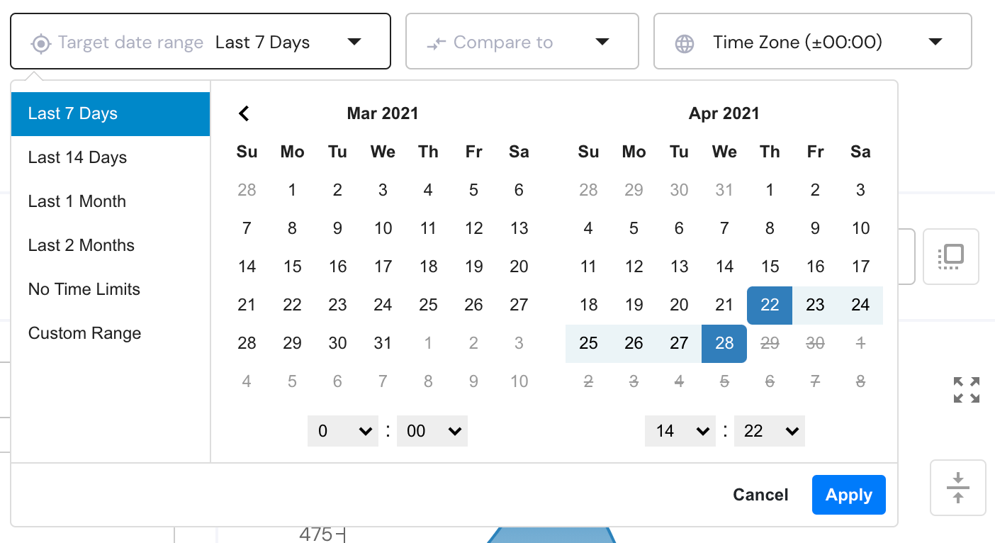
Define A Date Range
One of the most basic functionalities available on the "Investigations" page is choosing what time periods you wish to look at in your data. By default, the investigations page will show you the last 7 days but this can be changed with the control on the top of the page.\
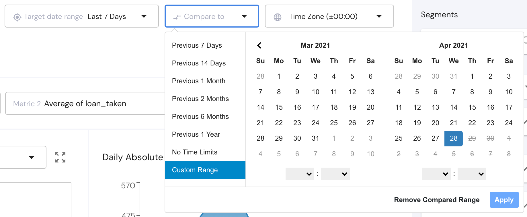
Now with the other control next to it, you can choose if you want to compare this time range to another time range and view the differences in the metrics' values. This mechanism allows you, for example, to manually look for interesting drifts in metric values.\
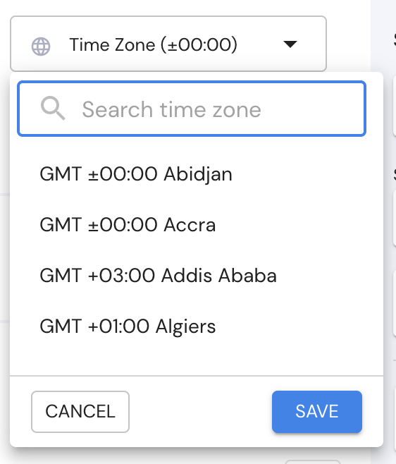
The third control lets you chose a timezone so you can view your data at the right time for you.
Choose Metrics
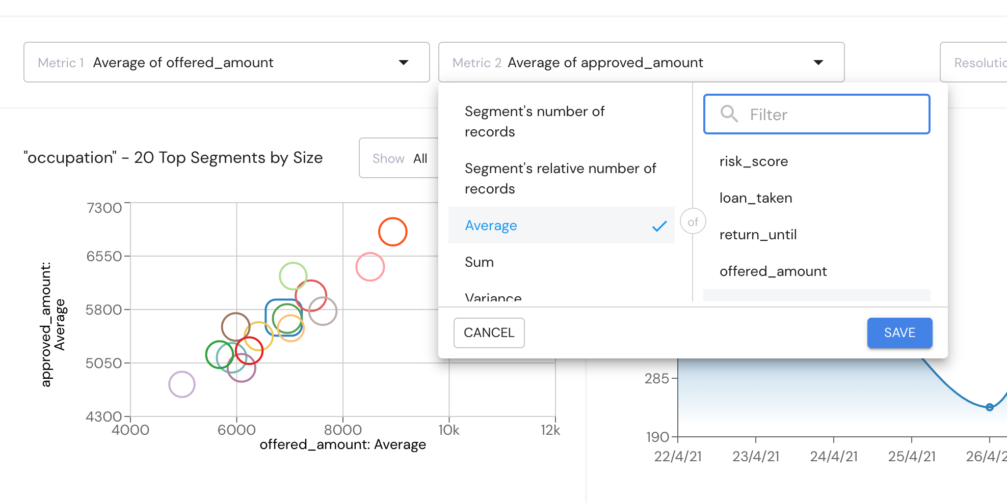
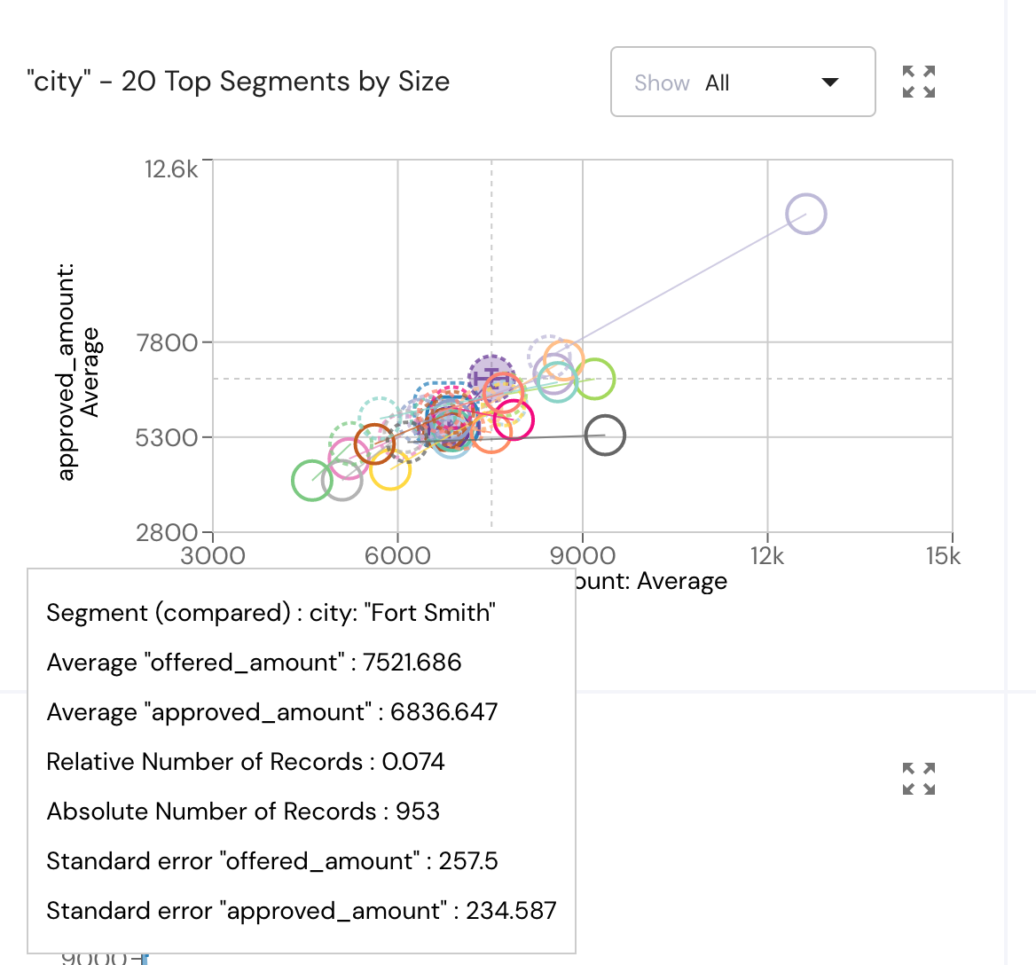
The investigations page allows you to choose 2 metrics defined by a variable's average, sum, standard deviation, existence ratio, or other statistical properties. The metrics you choose will serve as the X and Y axis in the bubble chart below.\
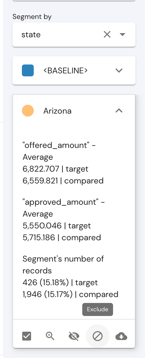
Segment the Data
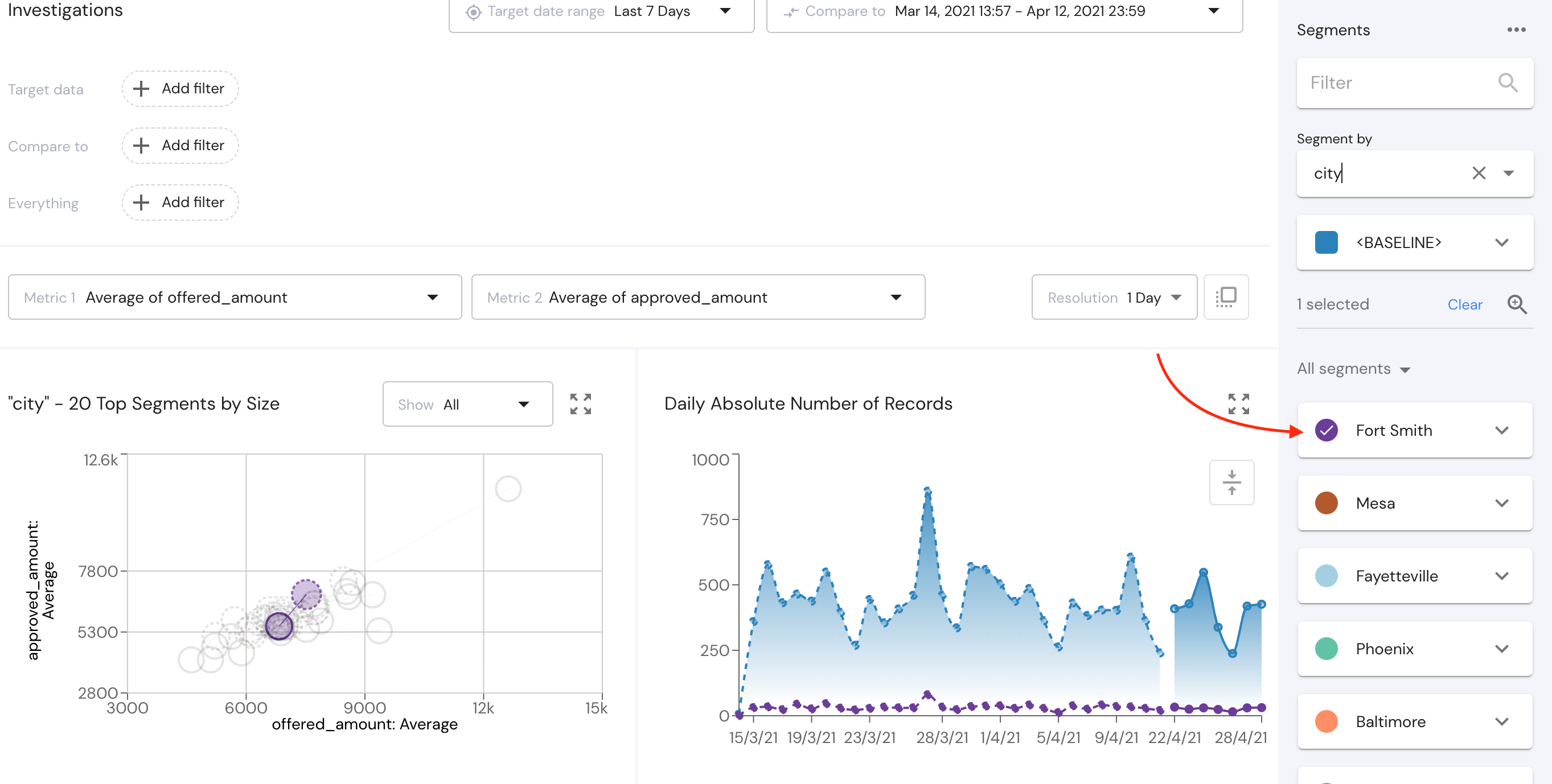
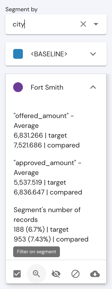
On the right sidebar you will find a segmentation option where you can choose according to which data field you would like to segment the data. For example, I want to segment the data according to different cities.\
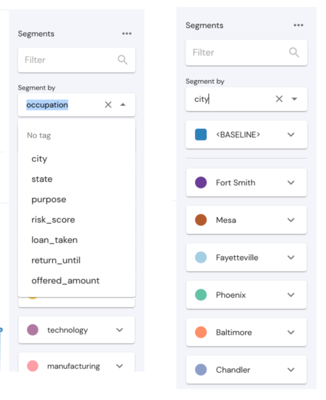
Once I have selected the field on which I want to segment the data, the values of this field will now be represented in the bubble chart on the left, as you can see as I hover over a bubble.\
By marking one segment or more from the list of segments, you will be able to see the values for the chosen segment highlighted in the scope of the data you are looking at now.\
Another option in the segmentation sidebar is to download a CSV file that shows you all records that apply with your filters and matches the segment you are choosing. For example, I want a CSV file of all records from the city "Mesa".
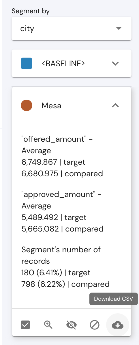
Note - If the chosen segment has more than 50,000 records Mona will generate a sampled CSV file from your data and give you up to 50,000 records in the CSV file.\
Filtering and Excluding Data
If I now want to dig deeper and view only data from one specific city, I can open the city card on the right and click on the "filter on segment" button.\
Now the investigations page will show us the same time periods and the same metrics, but only on data from my chosen segment.\
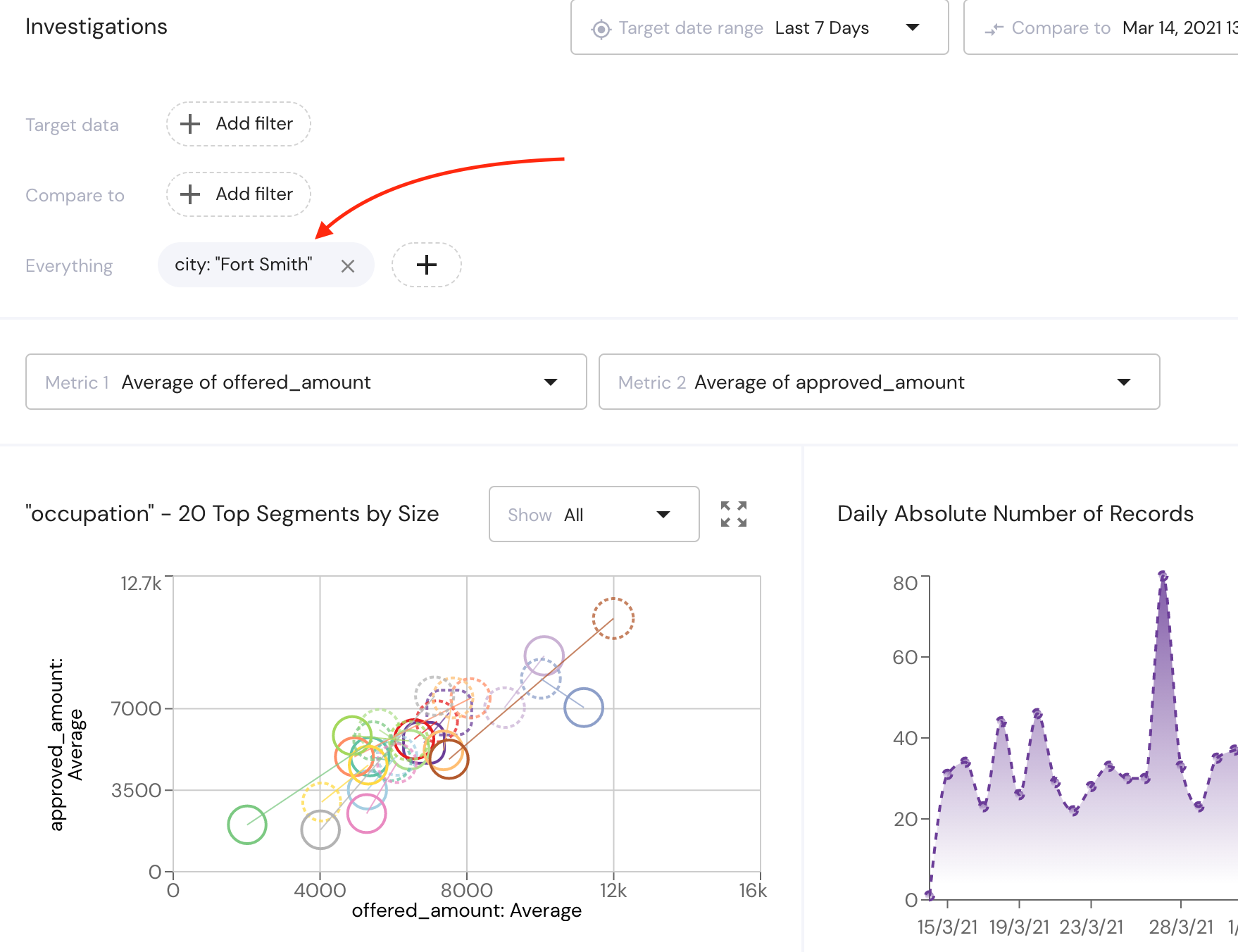
Now that I am looking only at data from a chosen city, I can dig deeper again and segment the data according to a new field (for example - loan_purpose) and then filter on a specific value again (home construction). The result of this will be an investigations page that shows you data only from the chosen city where the loan purpose is home construction. This can be done again and again as much as you need to dig in your data.\
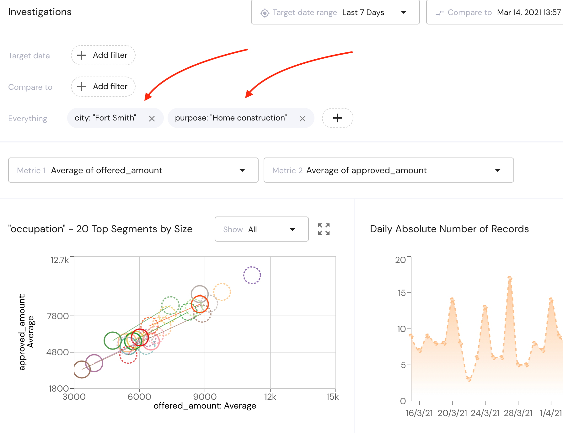
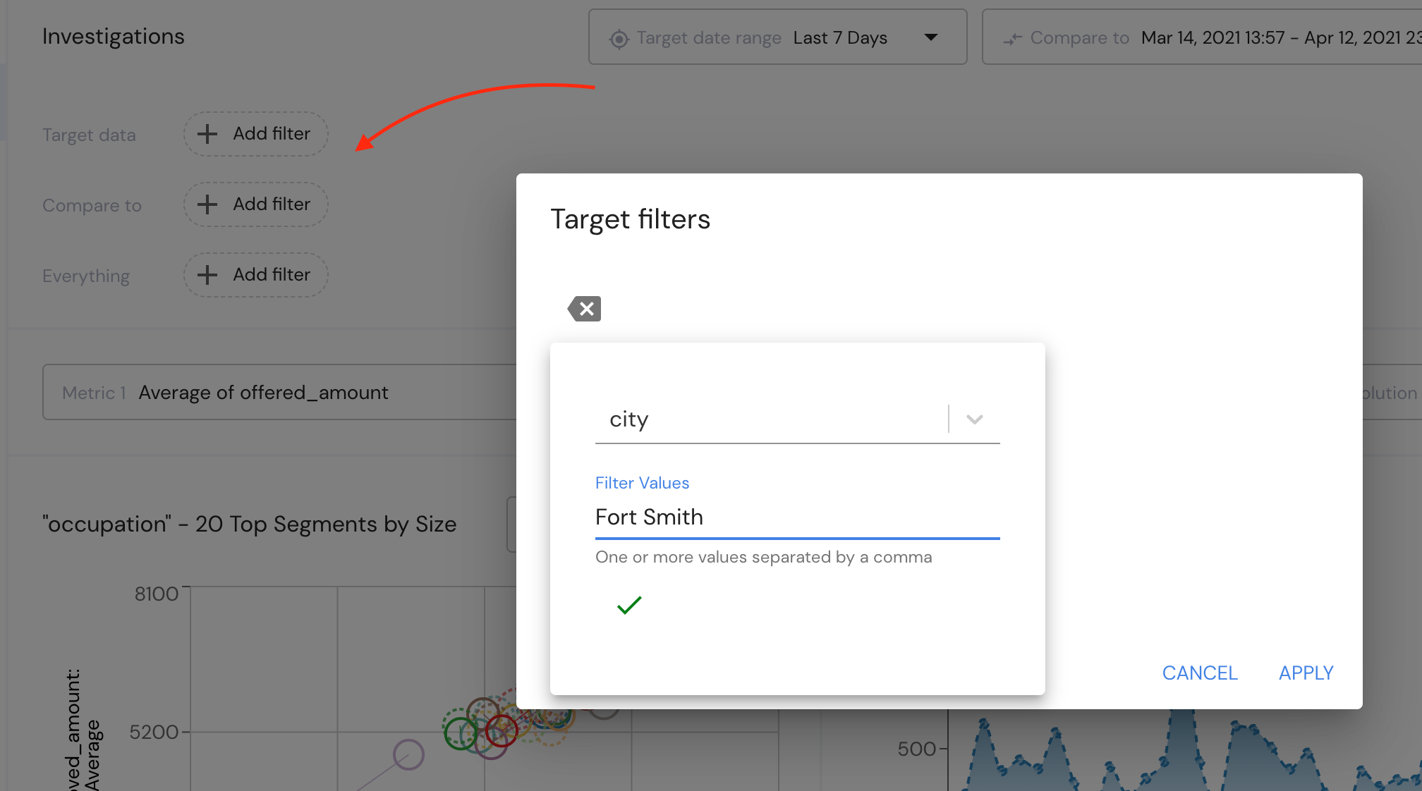
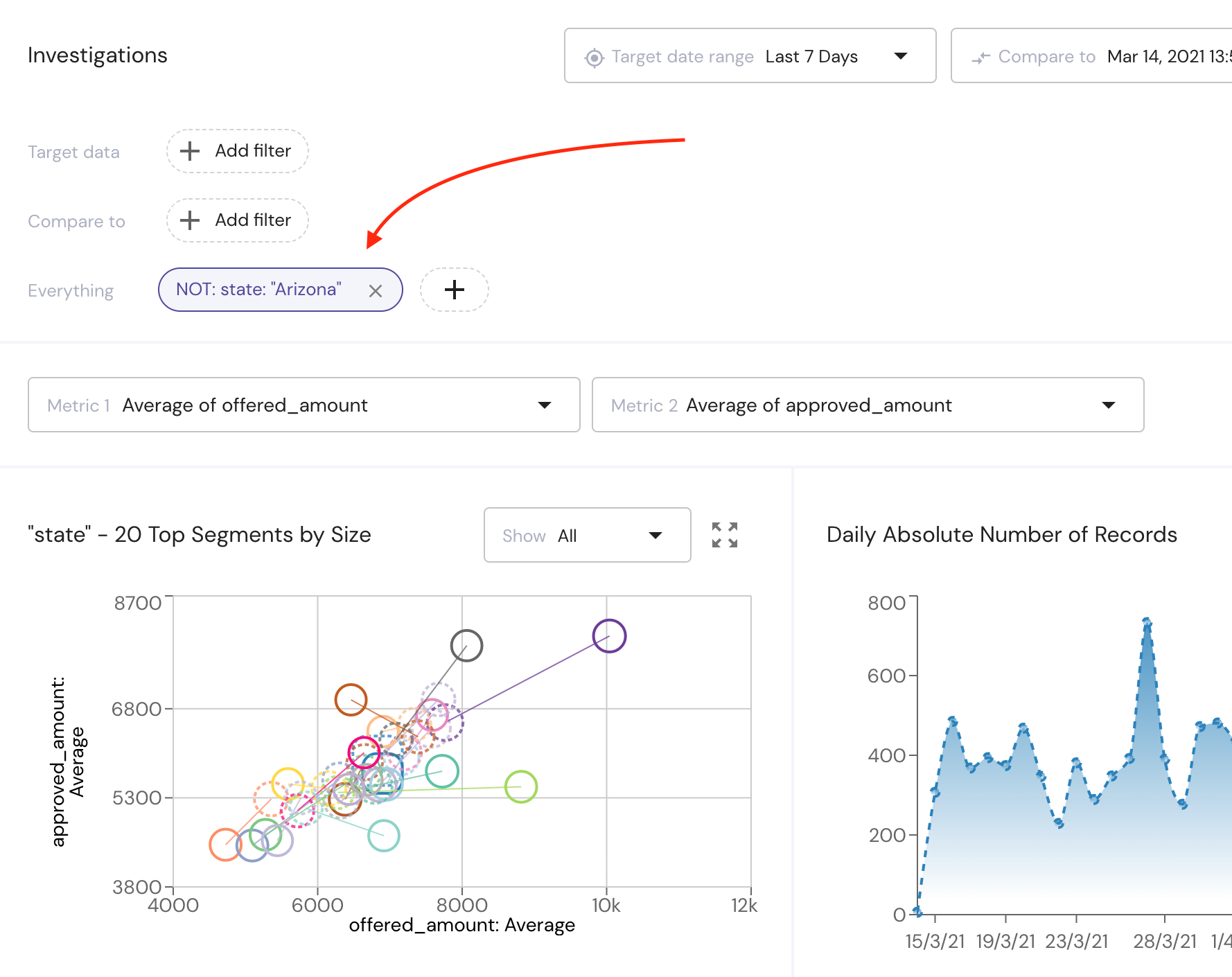
The same can be done via the "add filter" buttons at the top of the page. If you are looking at one time period you can add a filter of the whole data, but if you are comparing 2 time periods, you can choose different filters for the target period and the benchmark period. This allows you, for example, to compare training data to inference time data, or to compare data from two distinct model versions.\
You can also do the opposite and exclude certain segments from your data and view your data without this segment affecting the metric values. This can also be done via the segment card on the right, but now you can click on "exclude segment".
For example, I want to view my data and the average of my metrics, without the data from the "Arizona" state affecting the average, so I can segment the data according to "states" and exclude this state.
The result will be an investigations page without Arizona.\
Charts
The investigations page provides you with a number of dynamic charts which change according to time periods, metrics, and segments chosen.
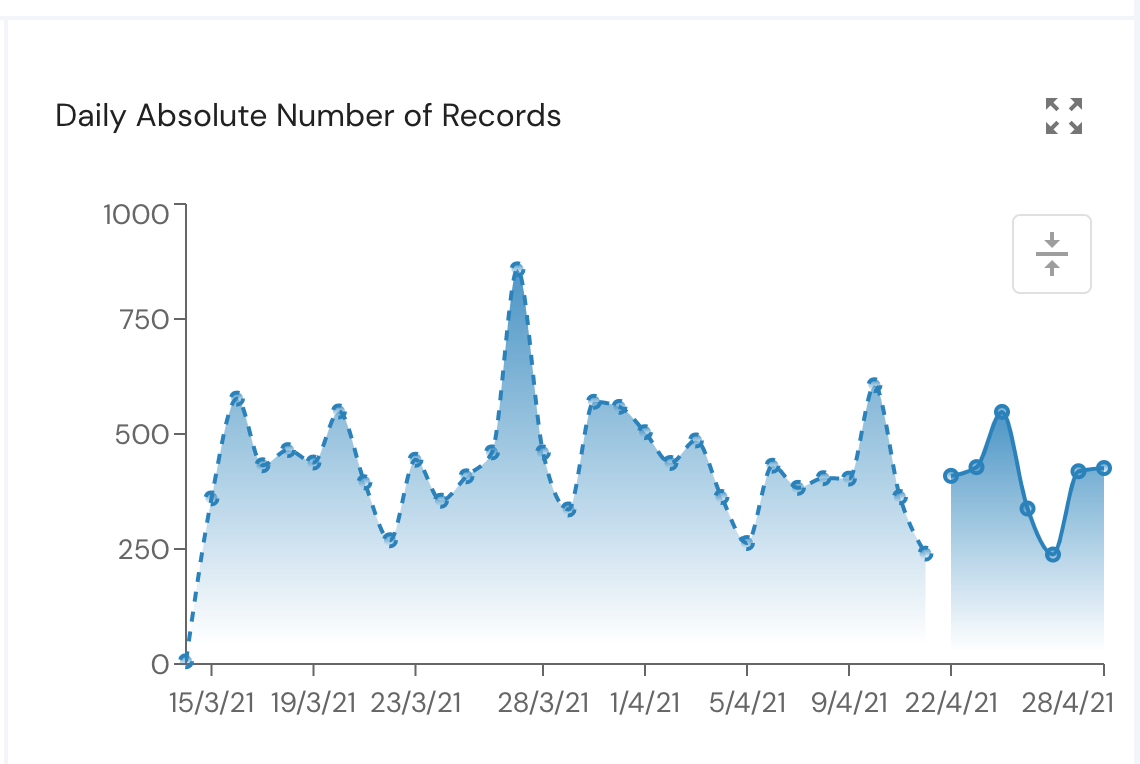
Daily Absolute Number of Records
The chart at the top of the page on the right will show you how many records are there in your data that correspond with the time period and filters applied. When looking at compared time periods you will see a separation in the chart between both periods.
By clicking on the "normalize" button, Mona will show you the relative number of records from the baseline data instead of the absolute number.\
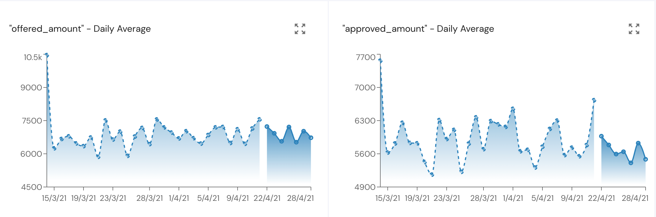
Metrics Over Time
The two charts below show you the daily average/sum/standard deviation etc.. of both your chosen metrics.\
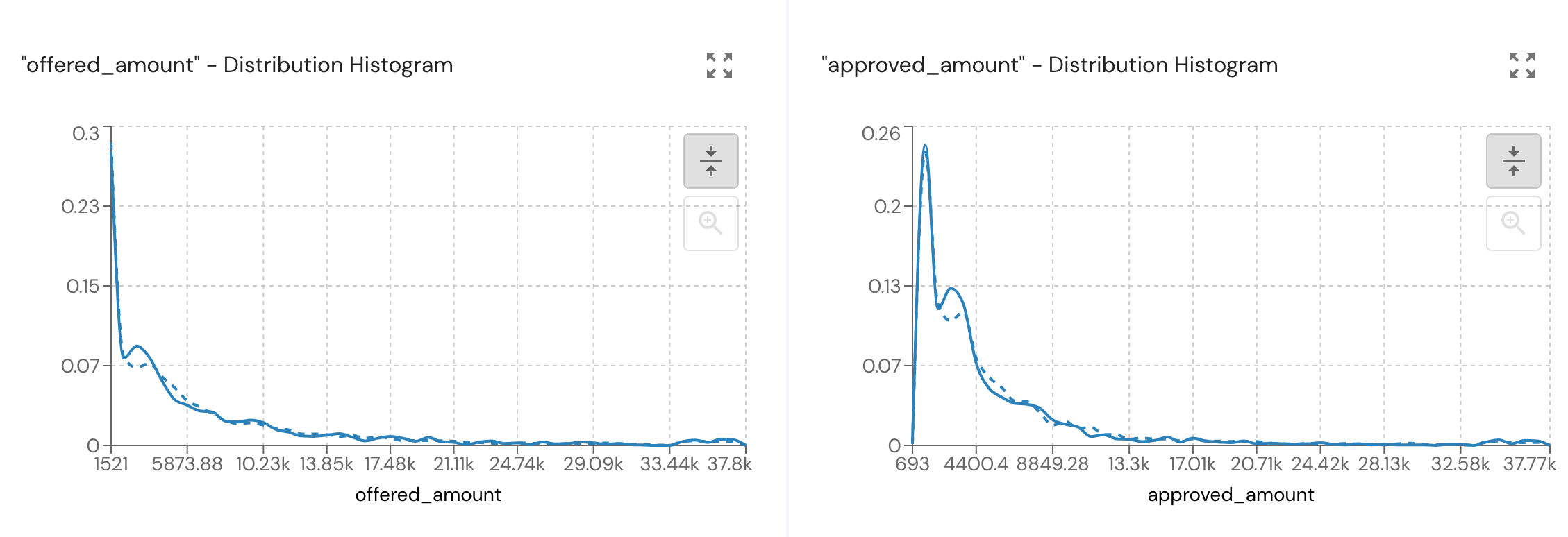
Metrics Distribution Histogram
The next two charts show you the distribution histogram of both your chosen metrics.
Note that you can zoom in on values and see a more detailed histogram by marking a range in the charts.\
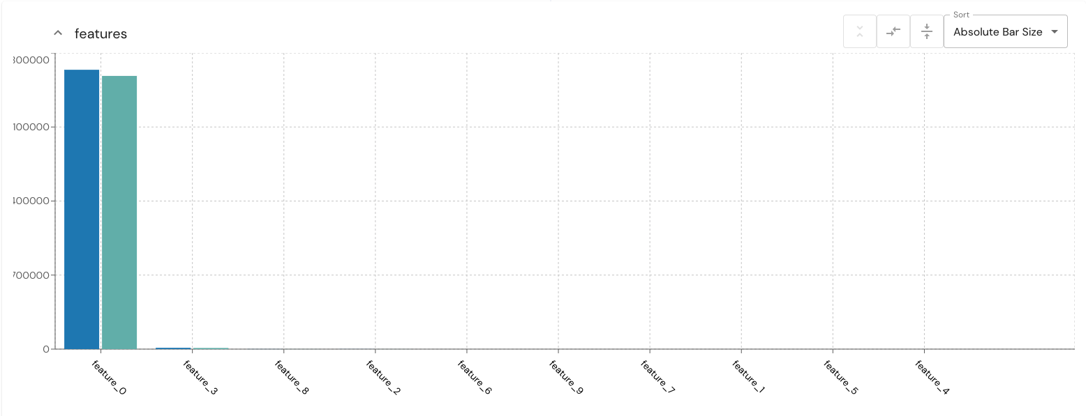
Field vectors
A visual representation in bar chart form of a list of all relevant fields. Can be used for example for classifiers. e.g, to show values of different languages in a language detection model.
Segments Table
The segments table at the bottom of the investigations page gives you a different way to view your data. The segments shown in the table correspond with the segmentation field you chose in the segmentation sidebar and as a default is sorted by the size of each segment.
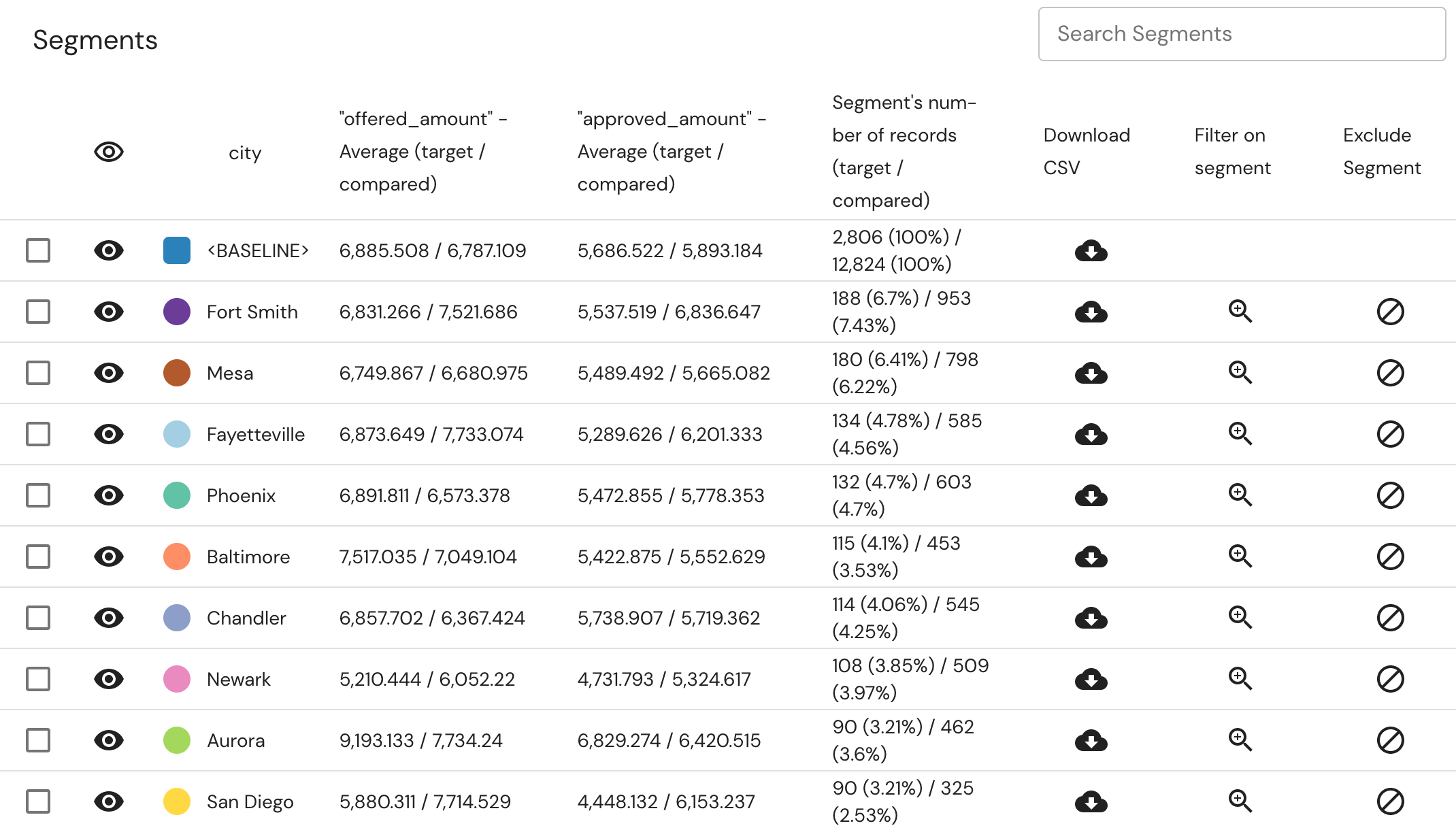
This table gives you the same options as given in the segment card in the sidebar - filter on a segment, exclude a segment and download CSV. Besides this, you can sort the data according to the values of your chosen metrics, and select segments to show in the charts.
Verse Creator
The investigation-based verse creator takes all the configured controls in the current investigation page setup and suggests new verses that can be created based on those controls. The verse creator automatically populates the verse params based on the “ target time range”, “compare to”, “timezone”, “target”, “compared” and “everything” filters, “metric_1” and “metric_2”, “Segment by”, “time resolution” and “min segment size” controls.
Read more here
Updated 2 months ago