
How to Use the Investigations Page
A key capability of Mona’s Dashboard is the "Investigations" page . It is used for data exploration, root cause analyses, and hypothesis testing. This page allows you to view your data, segment it according to any variable, compare metrics behaviors in different time ranges or using different filters (e.g., comparing training to inference time), and many other data exploration and reporting capabilities.
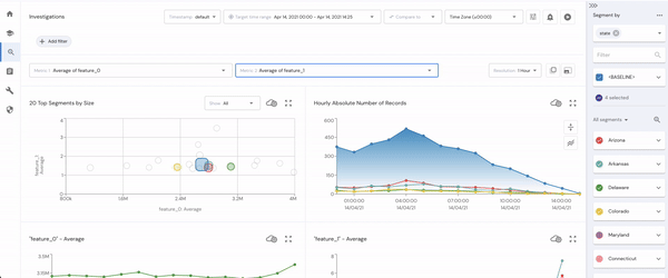
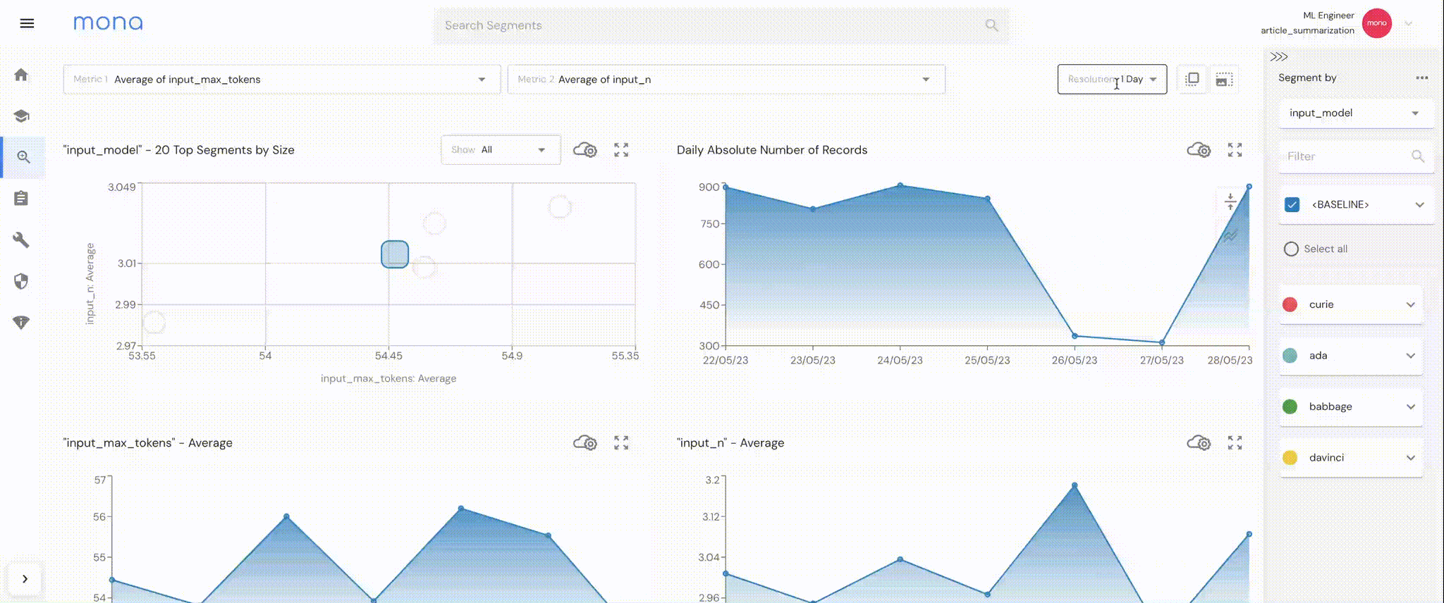
The Investigations Page
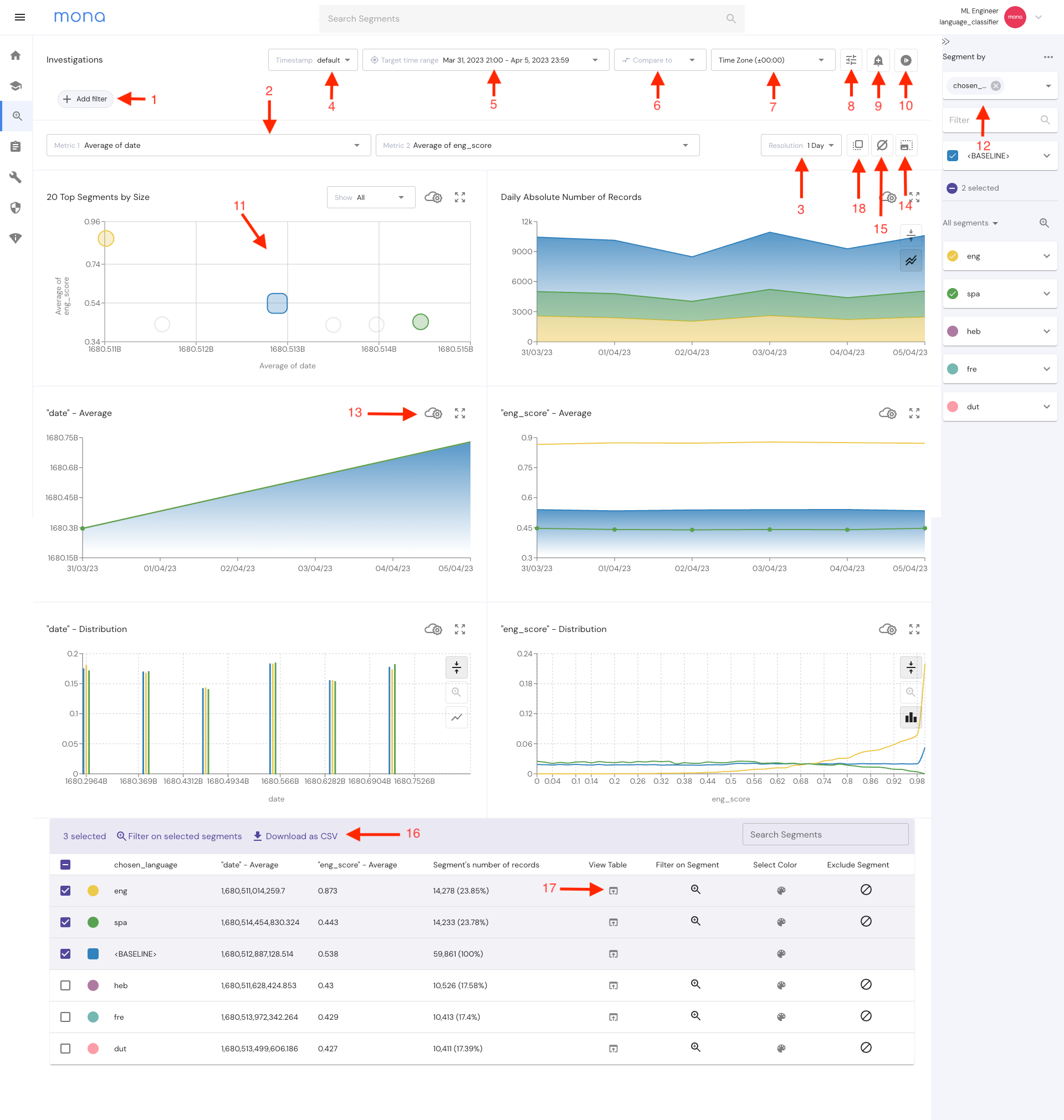
1. Filter Controls
This control opens a filters window, allowing you to filter in or out the data you wish to investigate.
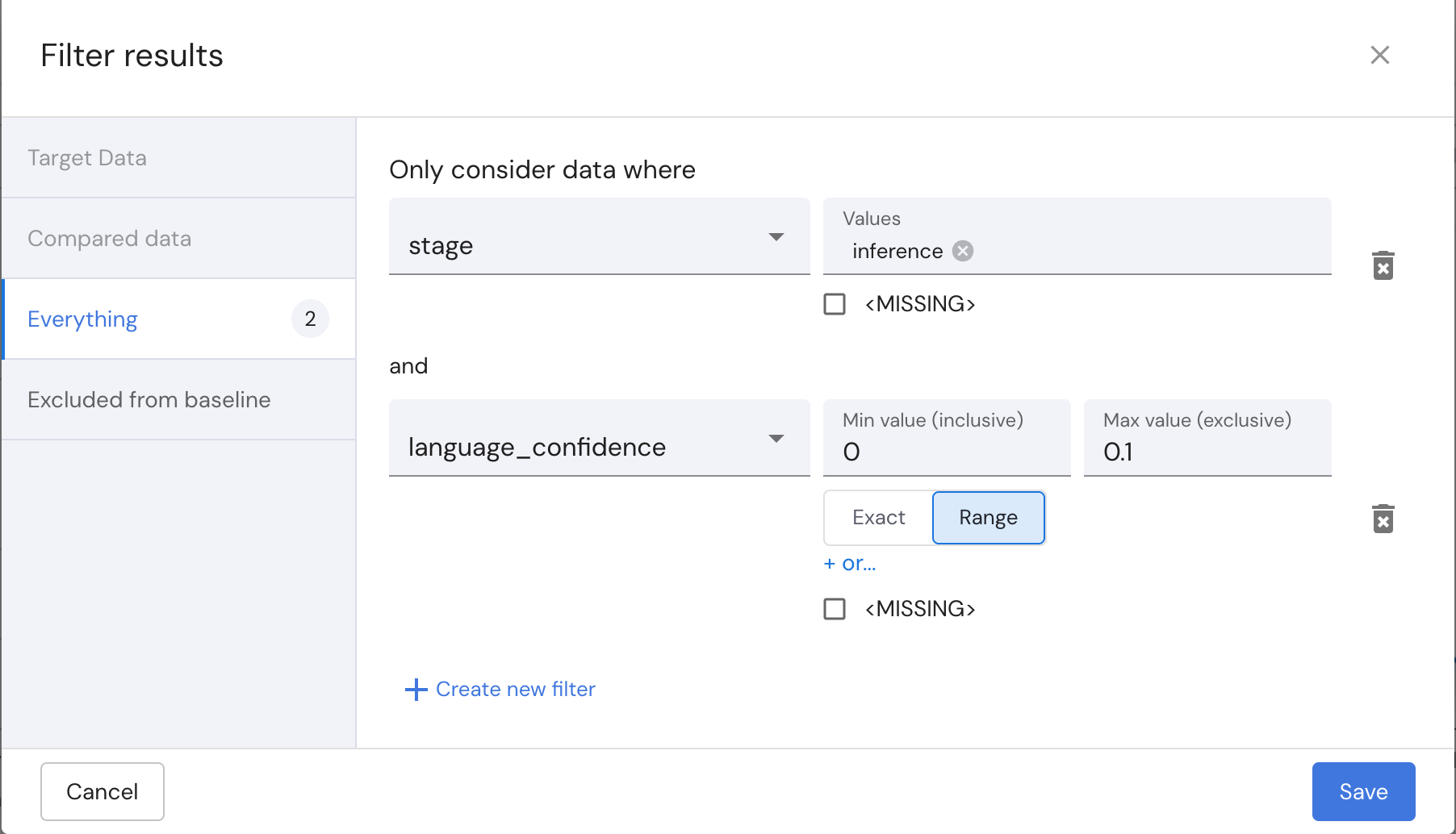
When a compared time period is set, the first two filter tabs become accessible. These tabs allow you to apply distinct filters to the target and compared data sets ,e.g., comparing training to inference.
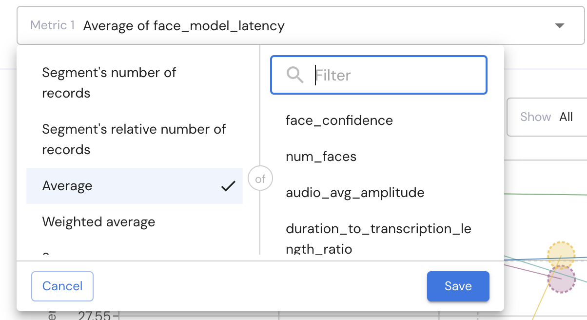
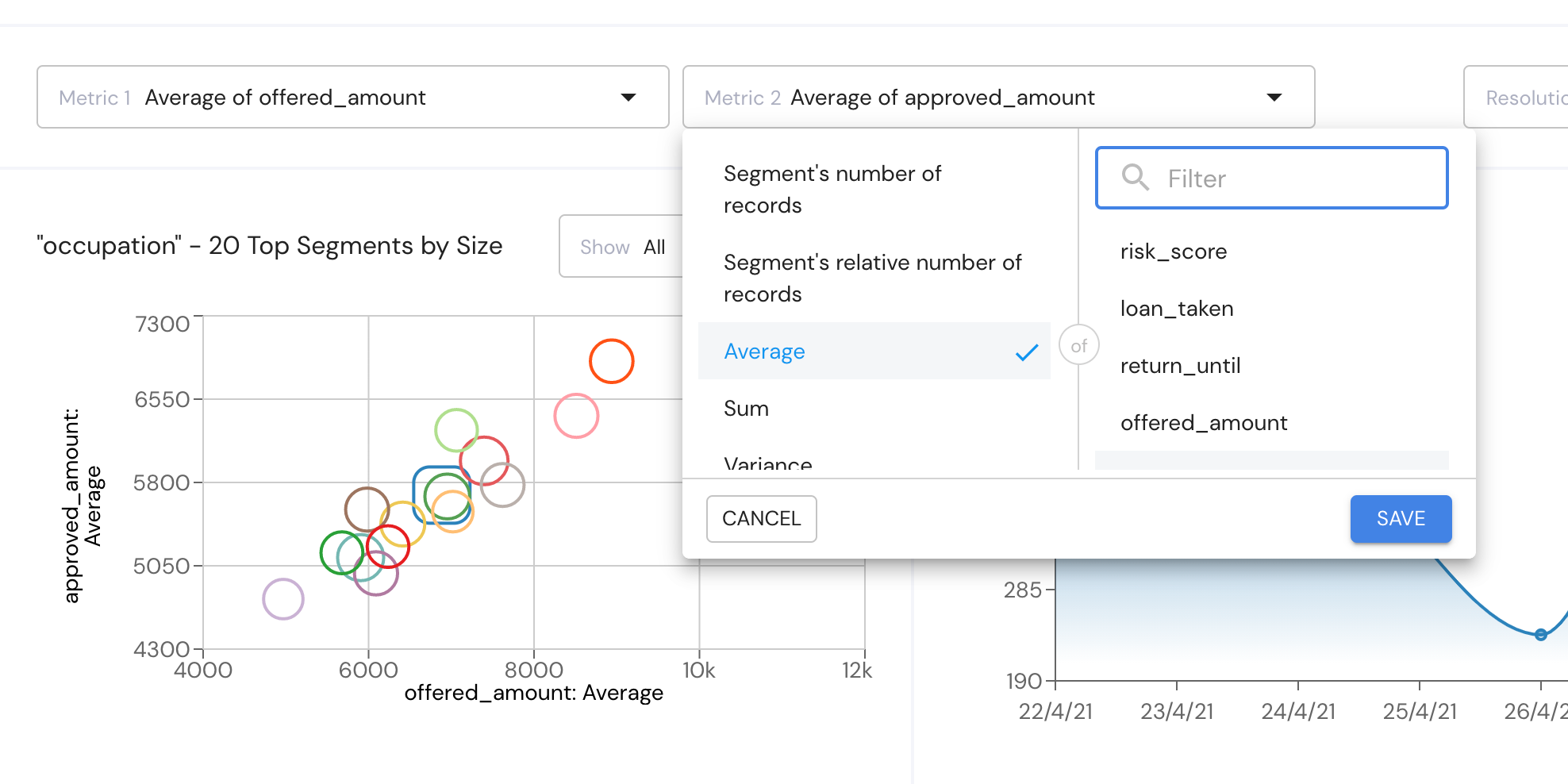
2. Metrics Controls
The investigations page allows you to choose 2 metrics defined by a variable's average, sum, standard deviation, existence ratio, and other statistical properties.
These two metrics will be used in visualizations across the dashboard.
3. Charts Time Resolution
This control sets the time resolution of all the time series graphs on the dashboard.
The granularity of the resolutions options depends on the chosen time rage.
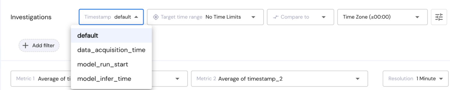
4. Timestamp field
The Timestamp control allows users to dynamically adjust the timestamp perspective. This selection affects how the data is displayed, while the default remains the record’s send_timestamp. Find more information regarding timestamps here.
This control is only visible when you have more than one timestamp in your data.
5. Target Time Range
The Target Time Range control allows you to select the period you want to analyze. By default, the investigations page will show you the last 7 days but this can be changed with the control on the top of the page.
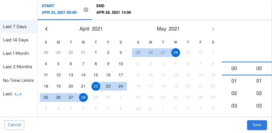
6. Compared Time Range
This control allows users to compare the target time range to another time range in order to analyze differences. So for example you can compare your system’s behavior in the last week to the previous week. Users can also apply overlapping time ranges and distinct target and comparison data filters to create comparisons between datasets, e.g., between training and inference data.
7. Time Zone
This control lets you chose a timezone so you can view your data at the relevant time perspective.
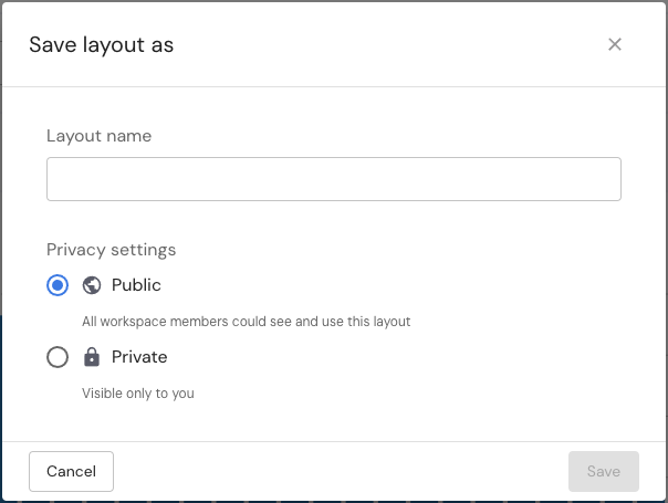
8. Presets
Save different presets of investigations page controls to later apply and merge with other existing investigation controls.
This feature allows you to save a configuration layer that defines how data flows into the graphs.
For instance, you can save a comparison between the training data and the inference data.
These presets can be saved and easily accessed whenever required.
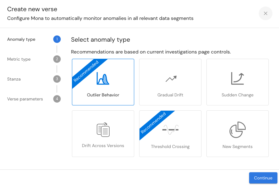
9. Verse Creator
The Investigation-based Verse Creator uses the configured controls from the current investigation setup to suggest new verses that can be created.
This feature enables users to generate reports on specific areas of interest and set up tests to automatically track for similar data behaviors over time.
10. Continuous-refresh Control
The Continuous-Refresh button transforms the Investigations Page into a live dashboard, automatically updating every few seconds with the latest data.
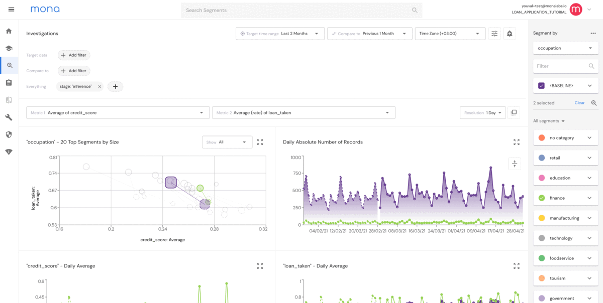
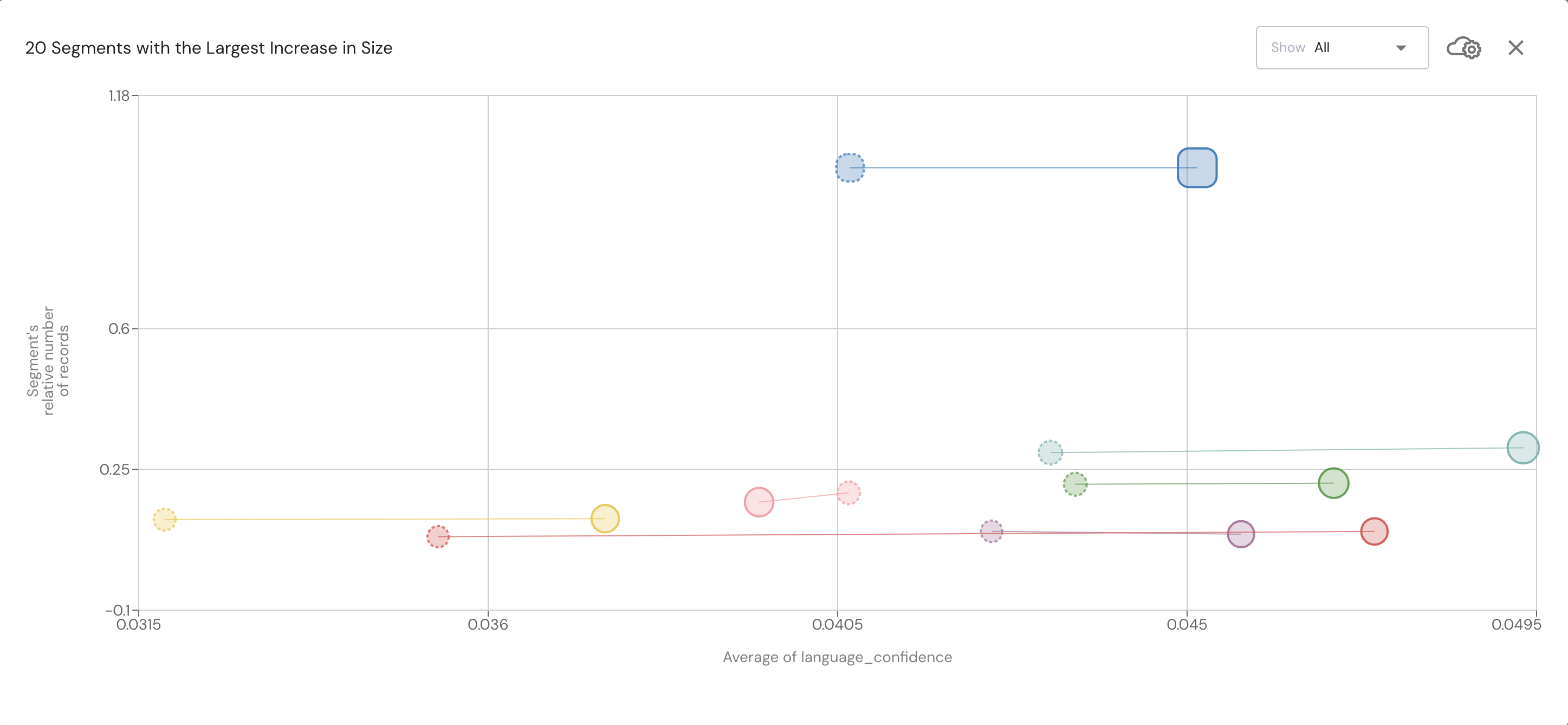
11. Bubble Chart
The metrics you choose will serve as the X and Y axes in the bubble chart, and each bubble represents a segment in the dimension you choose. In addition, you can control the number of segments in the graph by using the "show" drop-down bar.
If you set a compared to time range (i.e., performing a comparison), each pair of connected bubbles represents a segment. The solid frame bubbles represent the target time range segments, and the dashed frame bubble represent the compared time range segments.
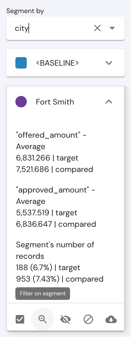
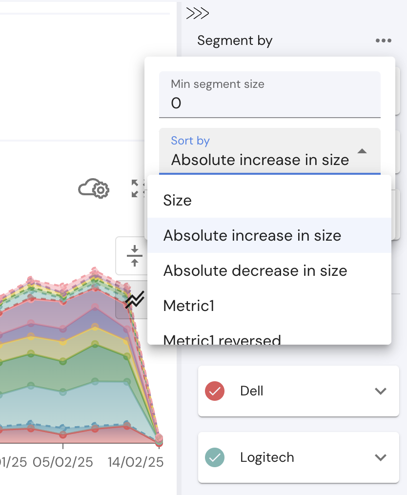
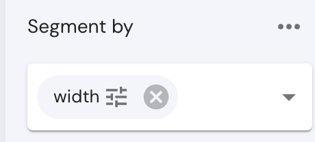
12. Segment by Side Bar
The right sidebar provides segmentation options, allowing users to choose a data field for segmentation.
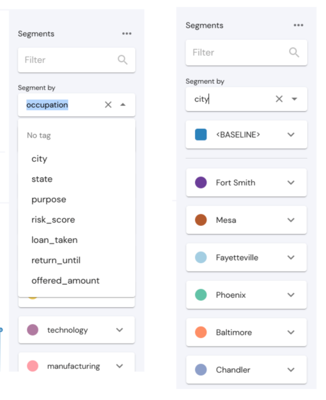
Once a field is selected, its possible values will appear as segment cards in the sidebar, and their data will be available in the various visualizations in the page.
You can choose more than one field to segment on, thus invoking “multi-dimensional” segmentation, looking at segments of your data defined by values in more than 1 field.
Additionally, the sorting control at the top of the segments bar allows users to reorder segments using various sorting options.
If a numeric field is selected as the segmentation dimension, Mona automatically creates a default segmentation of its values, which can be modified by clicking the icon beside the segment name.
Users can choose from segmentation options such as:
•Bucket Size - Segments data into fixed-size buckets using a linear scale.
Example:
• If bucket_size = 4, then the segments will be: 0 <= x < 4, 4 <= x < 8, 8 <= x < 12… and so on.
•Logarithmic Segmentation- Segments data using a logarithmic scale (base 2), ensuring that smaller values have finer granularity while larger values are grouped more broadly.
•Number of Buckets Segmentation- Segments data into a fixed number of equal-sized buckets within a given range (min_value to max_value).
Example: If min_value = 0, max_value = 9, and number_of_buckets = 3, then the segments will be:
0 <= x < 3, 3 <= x < 6, 6 <= x < 9
•Bucket Boundaries Segmentation - Segments data based on explicit predefined bucket boundaries.
•Discrete Segmentation - Assigns each unique numeric value to its own bucket instead of grouping them into ranges.
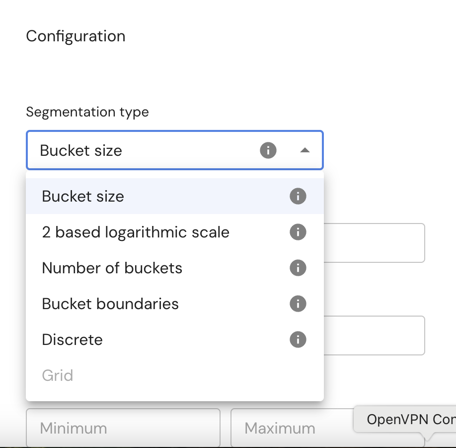
In all cases, you can save your segmentation for future use and set a default segmentation settings for every numeric field.
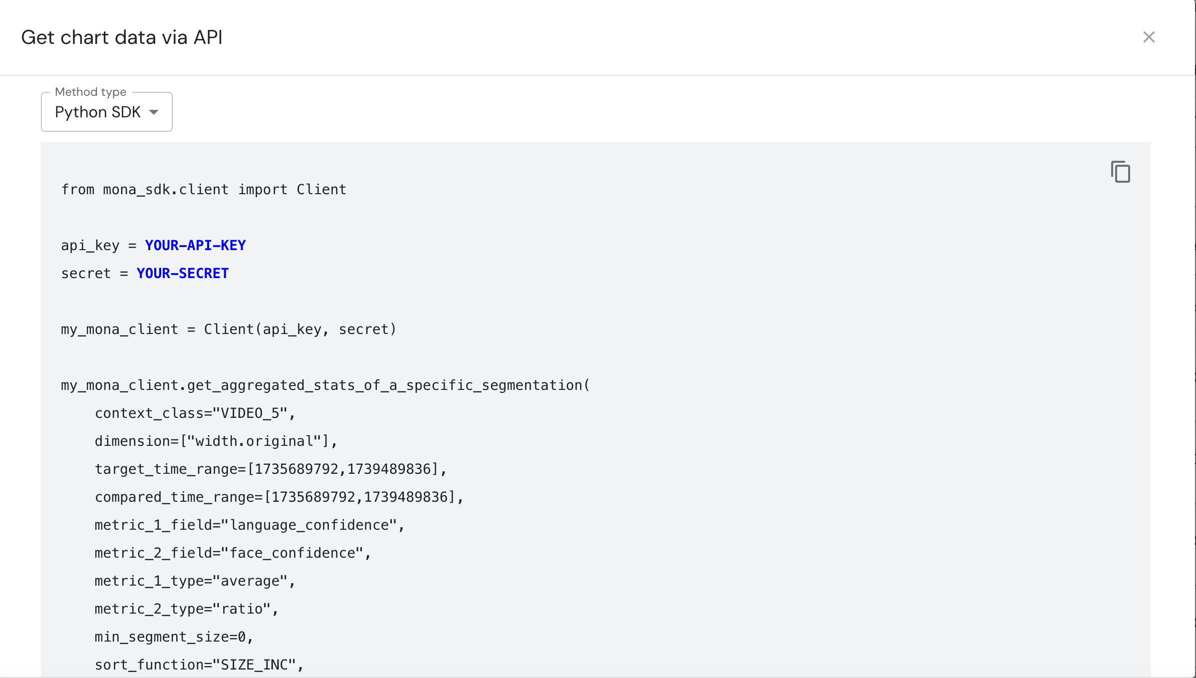
13. API query
Use this control to generate and get a boilerplate Python/Curl script that retrieves the chart's data via Mona API.
To get API key and secret visit the admin section- API Access.
14. Dynamic Layouts
Control the size and placement of graphs and other elements within the dashboard.
Save and Reuse: Once a layout is customized, it can be saved for future use, allowing for quick and easy access to preferred setups.
Sharing Options: you can also choose to share your customized layouts with your team for collaborative work or keep it private for personal use.
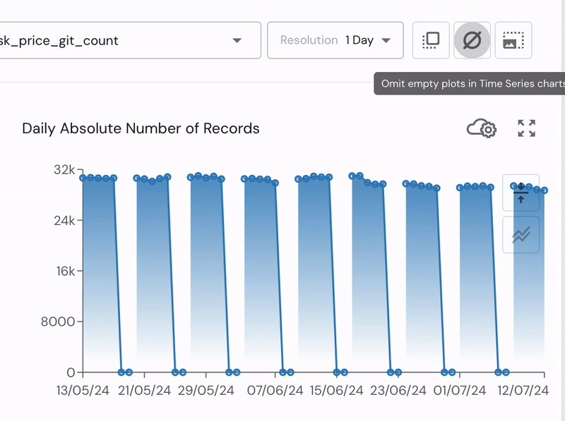
15. Omit Time Ranges with No Data
Users can omit empty time ranges from time series plots (e.g., exclude weekends in trading data).
16. Download a CSV
Using this feature, users can download a CSV/JSON file of the current Investigation Page data, with segmentation, filtering, and comparisons exactly as displayed on the page.
17. View Ingested Data
Use this control to export data of a specific segment.
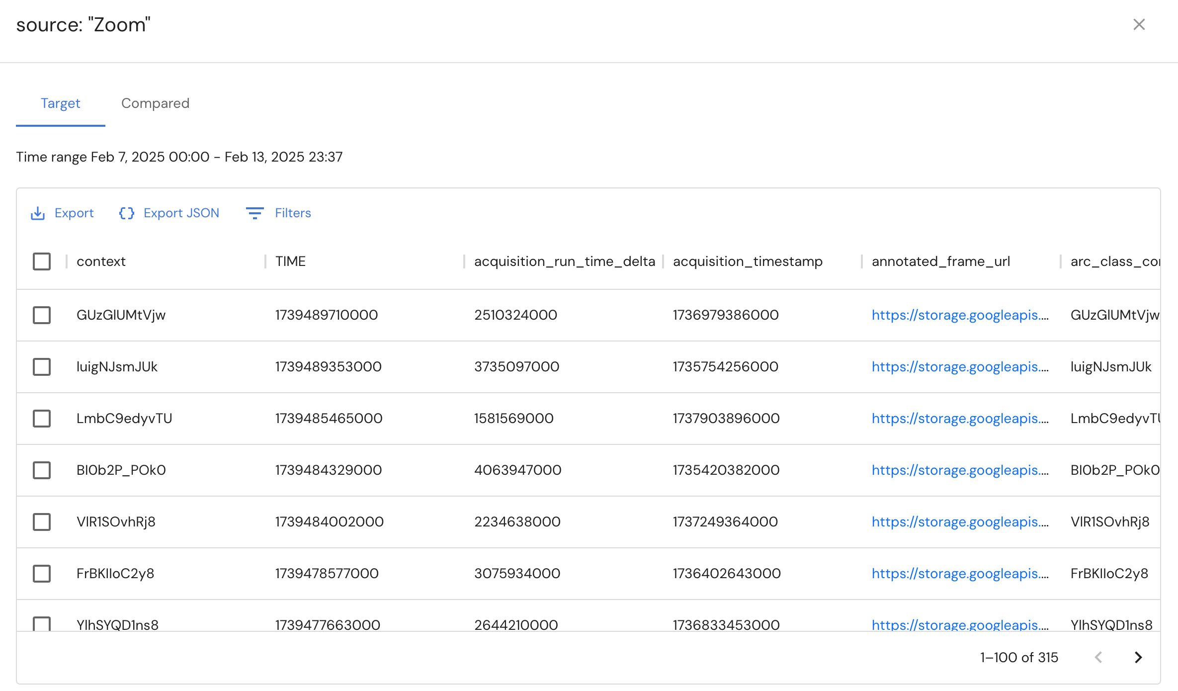
For segments larger the 50k, the response will be a 50k size sample of the segment. In order to get the entire segment, try to split the time range into sections.
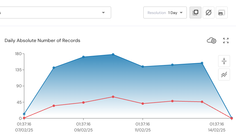
18. Enable/Disable Offset Control
By enabling offset, the time resolutions of every graph will be counted back from the latest record's time.
For example if the time resolution is 1 day and the last record time is 01:37:16, then all the graphs' tick marks will be counted back from this point backwards.
Updated 3 months ago